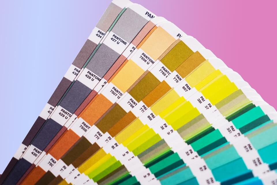
Color is vital to the user experience. It can have a significant impact on consumers, often in unexpected ways. Color saturation, contrast, and brightness can all make an impact on user experience. They can highlight different sections, categories, and functions within textual and visual information.
Color can cause a myriad of reactions, including drawing attention, reflecting a brand’s personality, emphasizing information, and evoking an emotional reaction. It can even influence consumer purchasing habits. A recent study found that up to 90% of marketing and product assessment is based on colors alone. There’s a substantial connection between color and user experience. It is essential to know how to use color in design and how it can benefit both businesses and consumers.
Improve Readability
Source: Harvard
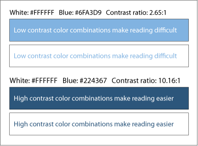
Readability is one of the most valuable ways that color and user experience are connected. Color influences the legibility of text. When disseminating messages via an outlet like social media or a webpage, color plays a significant technical role in improving the readability of textual information. Businesses must choose colors that work well together so that the text is easy to read. There needs to be a significant contrast of brightness between the background and foreground colors.
Color and user experience affect readability substantially. Contrast makes things easier to read. For example, white text on a black background is easy to read. This is because there is a significant contrast between the two colors and they work well together to make the text easy to read. Conversely, white text on a bright yellow background would be difficult for a user to read. This is due to the lack of great contrast between the two color options. It should also be noted that one should be careful when using bright colors, as they can be tiring for the eye to view for long periods.
Use for Emphasis

The connection between color and user experience can also be seen through the use of color for emphasis. Color can be used to emphasize or highlight important areas on the screen and key areas that should be focused on, such as by using a bold color for a call-to-action button. It can control user attention on a page. To use color for emphasis, contrasting or vibrant colors should be used to catch the user’s eye. As with readability, this makes it easy for the user to read.
Color vibrance is also important for emphasis. The combination of color and color vibrance is used to draw the user’s attention. This use of color and user experience also supports clickability. For example, a bold red “buy now” with white text will easily draw a user’s attention. The vibrance of the color emphasizes the desired action. A recent study found that simply changing a call-to-action button from green to red increased clicks by 21%. Color can make all the difference with conversions. For a less common reaction, use less vibrance.
Show Hierarchy and Status Change
The value of the link between color and user experience can also be seen in color’s influence on hierarchy. Color can help draw attention to different elements on a page in a certain order. Color can be used to create hierarchy and show status change through the use of font size, placement, and color changes. By using color, prominence can be established to key content on the page. This also provides continuity on a page. Using the right colors can lead users to interact with information on a page in your desired order.
To show hierarchy, it is essential to use high-contrast color and indicate the importance of one item over another by using a stronger color contrast between elements on the page. Black and white work well together, as do complementary colors on the color wheel such as blue and orange. However, remember to use a limited color palette in the user interface (UI) for a better user experience. The use of too many colors can be distracting; there’s definitely an art to good use of color and user experience.
As with hierarchy, color can be beneficial when showing status change. When the status is more important or urgent, color can be utilized to emphasize urgency. Consider the changes in color with traffic lights. To show the urgency of stopping, lights change abruptly from yellow to red; the green then tells you to proceed again. Colors like red can convey urgency in taking a certain action.
This same concept of status change can be applied for color and user experience online, such as with call-to-actions. When a user clicks on a call-to-action, the button could change color to indicate the site’s feedback to their response. The right user experience strategies with color can help persuade actions and increase conversions.
Improve Accessibility
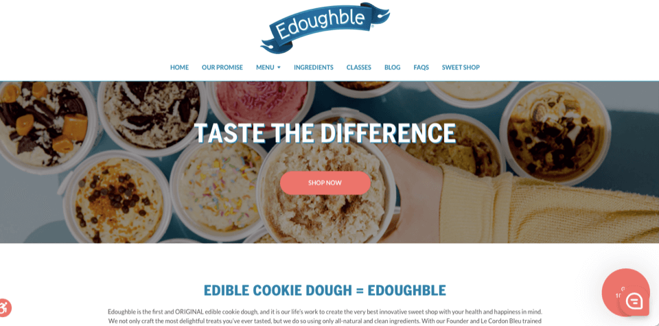
Color and user experience are also important considerations when it comes to accessibility. Text that has a poor contrast of color with the background makes it difficult to read for those with low vision. For example, in the picture above, the webpage features an effective CTA button and text that are easy to read thanks to strong contrast between text color and background.
The selection of colors within a chosen color palette matters, too. Color vision deficiency, or color blindness, affects around 8% of men and 0.5% of women. Red/green color blindness is especially common. This means that these individuals can confuse any colors with red and green values. For example, they might struggle to differentiate between blue and purple because they aren’t able to see the red value in purple.
Accessibility is important when it comes to color and user experience. When utilized properly, color can be used to improve the accessibility and usability of websites. This is valuable because it benefits more people online. Accessibility can be improved by using colors that are optimal for those that are colorblind or have a color vision deficiency. Color combination, saturation, and brightness are a few factors that should be considered when working with color and user experience.
To help with accessibility, web pages could use saturated and well-contrasted colors in the user interface. Research shows that a contrast ratio between text color and background color should be around 4.5:1 or 3:1 for large text for accessibility. Too high of a contrast should be avoided, because it can also be difficult to read for some users. For example, it may be beneficial to use an off-white background rather than a white background to aid in usability and readability. Colors at opposite ends of the color spectrum are also easier to read. Consideration of color and user experience can be utilized to benefit the widest range of users online and create an inclusionary experience.
Generate a Response and Influence Decisions

People have general associations with certain colors. Colors carry different positive and negative connotations. Connotations demonstrate how significantly color and user experience are linked with one another. They can make people feel a certain way about a brand. The exact color, vibrance, saturation, and brightness can all greatly influence feelings and communicate different meanings to people. Color can also communicate brand recognition. According to a study by the University of Loyola, color increases brand recognition by up to 80%. Using the right colors can help consumers remember a brand, such as Google’s use of a simple palette. They can also generate a response or feeling of connection with that brand. Color can have a strong influence on emotion and response. It can motivate people to take action.
Color and user experience are directly connected. The use of color impacts how a person feels about a brand and its messaging. For example, red is a color often associated with strength, importance, and danger. It is also a color commonly used by restaurants. This is because red affects metabolism, making consumers ready to eat. Yellow is also used because of its ability to easily gain attention. The combination of red and yellow encourages consumer action.
Blue is another great example of color’s ability to generate a response. Blue is a color associated with peace, trust, and safety. A study on color preferences around the world showed that blue is the most favored color among both men and women. Using this color can cultivate a feeling of trust in brands, which is why it is so popular. It’s a trusted color. Facebook/Meta, Microsoft, and Twitter all use blue in their designs.
Color and user experience can also be shown through the ability to set the tone or mood or communicate a feeling about a brand or product. The right color or color combination(s) can influence consumer decisions or generate a response such as clicking on a call-to-action button. However, you should not rely on color alone to communicate important information. Color connotations are often cultural, meaning that the use of textual information should be utilized in communicating critical information.
Increase Memory and Comprehension
Color also influences memory and comprehension of messaging. The combination of color and user experience is powerful. It can generate psychological and emotional responses in users. Color plays a significant role in enhancing memory performance. This is because color is a vital element in capturing attention and influencing attitude and decision-making. Ads using color attract people to read the ad up to 42% more often than a black-and-white ad.
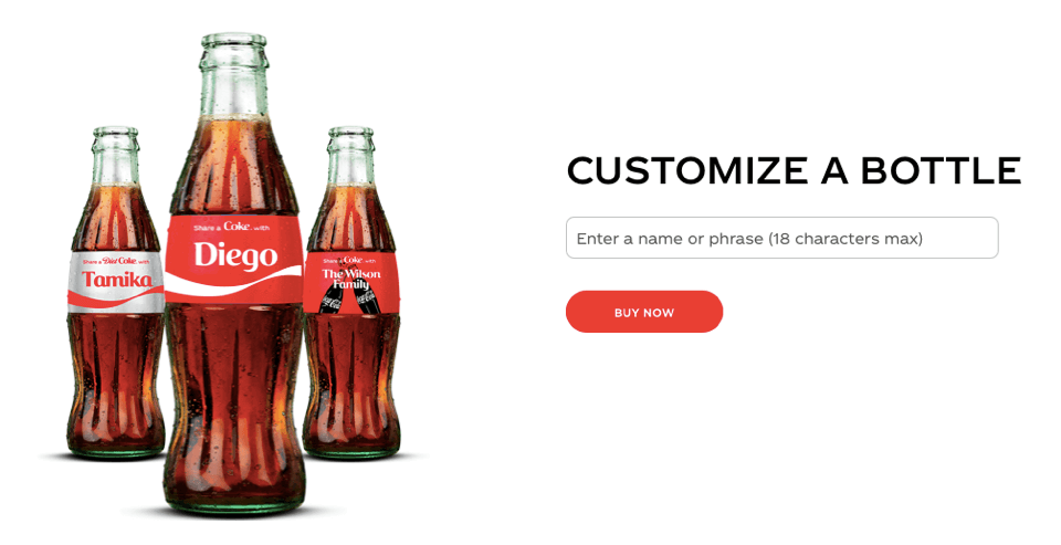
Color makes the message more appealing and more engaging to read. Warm colors like red and yellow have been shown to have a greater impact on attention than cool colors like green or gray. Food and beverage companies often use red in messaging and logos, such as Coca-Cola. However, the colors used should reflect brand personality and messaging. The better attention is captured, the better the memory performance. Users are more likely to comprehend and remember messaging that has caught their eye and kept their attention.
Choosing the Right Colors
The relationship between color and user experience is essential in the creation of content. While colors have general associations, your target audience is an important consideration. Color choice, along with saturation, vibrance, and brightness should be considered specifically in relation to the audience you’re trying to reach. For example, bright, saturated colors are more likely to be associated with youth or the portrayal of excitement. Other colors, such as blue, can help establish credibility and trust.
Color is a great motivator. Colors, vibrance, saturation, and brightness should relate to the brand and content and tone of messaging to users. It is also important to choose a color palette that an audience will resonate with and find visually appealing. The goal is to choose colors that will best convey messaging about the products or services being offered. The audience’s connection with colors will help generate the desired response.
Make the Most of UX With Great Use of Color
Color and user experience are connected. Colors used in content can substantially impact the extent to which a user connects with content and the brand disseminating it. The user-interface (UI) is the first thing a person sees. The balance of color and user design is powerful and influential. User design impacts how a user interacts and engages with a page. Color is more than a tool for aesthetics. It is an important factor that encourages people to stay on a webpage that impacts both usability and experience.
When using color, remember to limit the color palette being used. Too many colors can be confusing, overwhelming, and unpleasant for the user’s eye. The excessive use of colors can also decrease the accessibility and readability of information. Be sure to limit the palette to no more than 6 colors. This includes the use of black and white. Color and user experience are comprehensively linked. The right color choices are fundamental to optimizing the user experience, from usability to creating a visually appealing experience.
In a saturated online environment, businesses need to have a memorable presence. Color and user experience are intertwined, as are other factors. Things like site functionality, design, and messaging can all have a significant impact on user experience. If you’re looking to fine-tune your website and content, follow the BESTWEB blog. Our articles contain information on web design best practices to perfect your website’s user experience.